Flash, flow, feedback: Decoding game design signals
A guide to top arcade and online games, or the Top pokies in Australia (guide), might sound like a hook for a gaming site, but it’s also the perfect entry point to talk about something deeper: the way colour, motion and symbolism work together to keep players engaged. These design choices – sometimes loud, sometimes subtle – have been at the heart of interactive play since the first arcade cabinets. They shaped the neon glow of 80s game halls, and they still drive the design of mobile titles played on the daily commute. Strip back the tech and the psychology looks surprisingly consistent.
Game spaces: Where colour drives action
Game environments are not built for subtlety. They are built for impact. Design floods the senses with input: busy patterns, continuous sound, carefully tuned lighting. But the most precise tool is colour.
-
Red is the workhorse: urgency, excitement and a subconscious nudge toward speed.
-
Gold signals reward and prosperity, a payoff that feels larger than life.
-
Green appears in progress bars or level-up effects, tying success to growth and movement.
-
Purple often frames premium modes or rare achievements, signalling prestige.
These choices are not random. They are consistent because they work. It doesn’t matter if the theme is ancient legends, outer space or futuristic cities – the palette always loops back to the same psychology.
Motion in the gaming space
Animations could end instantly, but they rarely do. The delay between action and outcome is calibrated for suspense. That pause is where the tension lives. Games use motion everywhere – reels or wheels that slow dramatically before landing, mascots bouncing or blinking in loops, victory screens where coins or stars cascade endlessly, menus with shifting logos. Stillness invites reflection; movement pushes players forward. Even a “near miss” relies on animation, with flashing lights and rolling numbers tricking the brain into feeling as though something good has happened.
Symbolism in games: Familiar icons
Symbols carry centuries of cultural meaning, and games recycle them endlessly because they can be read at a glance.
-
Sevens: shorthand for luck in Western culture
-
Cherries: sweet, simple reward
-
Stars, crowns, dragons: universal icons of achievement or fortune
-
Local mascots: animals, landmarks or sports gear to make the game feel regional
Modern arcade-style titles remix these with local touches: kangaroos, boomerangs, sunsets glowing across backdrops. The message is always the same – these games belong here, they speak the local language, they feel familiar.
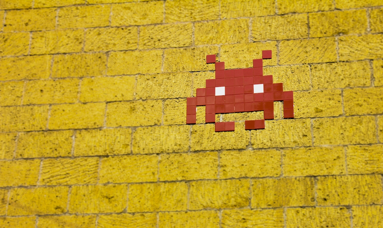
Arcade classics: Pixels, primary colours and motion that taught something
Arcades had fewer tricks up their sleeves, but they used them well. Pac-Man is yellow because it stood out on a black screen and radiated energy. The ghosts each carried their own hue and movement pattern – red as the chaser, pink erratic, cyan unpredictable, orange slow and indecisive. Colour and motion gave personality without a single line of dialogue.
Space Invaders created tension by speeding up as the screen cleared. Donkey Kong built urgency with flashing red barrels and bold blue ladders. Every choice was about clarity. Players had to recognise threats instantly in a noisy arcade hall.
Motion wasn’t just spectacle. It was communication. Mario’s jump was exaggerated but consistent. Street Fighter II built an entire competitive culture around animation frames, teaching players to read punches, blocks and counters like a language. If modern games use motion to create excitement, arcades used it to teach.
Mobile games: Bright screens, short loops
Fast-forward to mobile and both arcade and online gaming DNA are easy to spot. Match-three puzzles explode with light, combos cascade in slow-motion fireworks and “big wins” drag out longer than the gameplay itself. The actual reward is points, but the real hook is the visual spectacle.
Colour is cheerful and exaggerated – neon pinks, greens, oranges. Motion is about cascades and combos that feel bigger than they are. Symbolism is approachable and safe: sweets, jewels, animals.
Other titles lean in different directions. Pokémon Go taps into collection psychology, where rare creatures symbolise status. Clash Royale mimics reward mechanics with daily chests and glowing timers. In every case, the phone vibrates, the screen pulses and the loop feels awfully familiar to anyone who has spent time in an arcade.
The Language of Play Design
When comparing different styles of interactive design, it helps to look at how familiar categories use colour, motion, symbols and psychology to engage players. While each tradition has its own visual language and pacing, the underlying mechanics often echo one another in surprising ways. The following table highlights these distinctions and parallels side by side.
|
Category |
Online Games |
Arcade Classics |
Mobile Games |
|---|---|---|---|
|
Colour |
Reds, golds, greens; urgency + reward |
Primaries for clarity |
Neon tones; candy-bright palettes |
|
Motion |
Spinning wheels, flashing rewards, animated menus |
Exaggerated jumps, attack frames |
Cascades, combos, slowed wins |
|
Symbols |
Sevens, stars, cultural icons |
Ghosts, ladders, barrels |
Candy, jewels, creatures |
|
Psychology |
Anticipation + arousal |
Rhythm + skill clarity |
Dopamine loops + constant nudges |
The packaging changes, but the psychology does not.
Australian arcades and game lounges: Local flavour, same core
In Australia, game lounges and arcade bars are as common in pubs as pool tables. The design reflects that context. Instead of intimidating luxury, cabinets and screens feel approachable. Warm reds, soft golds and familiar icons keep them grounded. Kangaroos, cricket bats and outback sunsets appear in artwork, making the games feel like part of the local culture.
The mechanics are unchanged. Near misses stretch out with dramatic delays. Bonus rounds explode in colour. Wins get exaggerated with sound and motion. The difference is the social layer. Groups gather casually around machines, treating them as part of a night out rather than a solitary challenge.
Mobile free-to-play: Arcades in disguise
Free-to-play titles borrow heavily from both arcade and online traditions. The “daily spin” becomes a reward wheel. The glowing chest acts as a prize vault. Countdown timers echo the suspense of waiting for a level to end. In-app currencies replace tokens.
The difference lies in delivery. Instead of coins clattering in trays, there is a vibrating phone and confetti animations. Instead of standing at a cabinet, the player is on the couch or waiting for a train. The design is no less calculated, but it is wrapped in bright wrappers that feel casual.
FAQs
Why do so many games lean on red and gold?
Because those colours trigger the strongest responses. Red urges action, gold signals reward. Swap them for beige and grey and the whole design loses impact before the first play.
Are mobile games really that close to arcade design?
Yes, and sometimes even more intense. Mobile designers borrowed arcade psychology and added push notifications. Now the machine doesn’t wait – it reminds the player when to come back.
What makes classic arcade design different?
Arcades focused on clarity. Moves were exaggerated so players could learn and improve. Skill mattered. A randomised online game rarely lets practice change the odds.
Do Australian arcades use different symbols than overseas games?
They do. Kangaroos, sunsets, sports gear. Same mechanics under the hood, different skin on the screens. It makes the game feel local, familiar and less intimidating.
Has there been real innovation in how design works today?
Not in the fundamentals. The tricks are decades old. What’s new is polish: higher-definition graphics, surround sound and mobile delivery. The wires are hidden better, but they are the same wires.
The editorial unit


Facebook
Twitter
Instagram
YouTube
RSS