How custom graphic overlays enhance industrial design
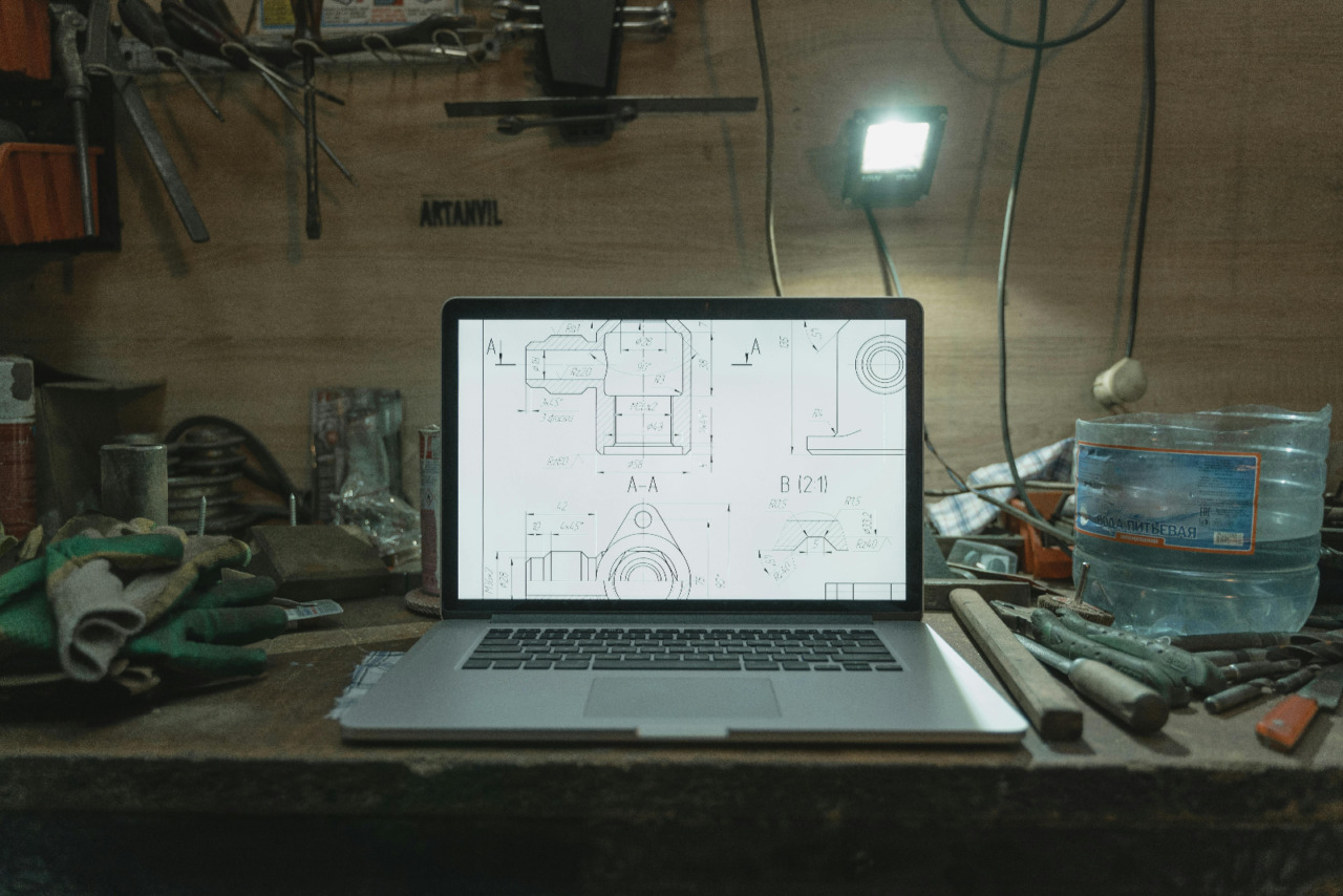
Walk past a control panel in a workshop, and the first thing you notice is not the wiring. You notice labels, symbols, windows, and buttons that tell people where to look. Those surface details shape the feel of a machine before anyone presses a switch.
That is why custom graphic overlays deserve more attention in design talks. They sit at the point where visual order meets physical action, and that makes them easy to overlook. Yet they affect how a product is understood, handled, and trusted from the first glance.
Good panels start with clear communication
An overlay does more than cover a panel face with printed graphics. It gives shape to the relationship between person and machine through text, spacing, icons, and touch points. When that layer is planned well, the equipment feels easier to read and faster to use.
This matters because industrial work often happens under pressure, with noise, gloves, time limits, and repeated tasks. The UK Health and Safety Executive says design choices in plant, equipment, and workstations can affect human performance, while user focused ergonomics can reduce error, accidents, and ill health. It also says users should be involved early in the design process.
A clear overlay helps operators answer simple but urgent questions without delay. What does this button do, what state is the machine in, and what action is safe here? When labels are legible and grouped well, workers spend less effort decoding the surface and more effort doing the task.
That same idea shows up in other areas of design too. Even in visual pieces about printed photographs made to last, the appeal often comes down to finish, clarity, and how the object holds attention over time. Industrial products work under harder conditions, but the design logic is not far removed.
Material choice changes the life of the product
Industrial products live hard lives, and the surface layer often takes the first hit. Panels meet grease, water, sunlight, chemicals, abrasion, and constant finger contact over long periods. If the overlay fades or lifts, the machine can still run, but the user experience drops fast.
Polycarbonate is common for this reason because it stands up well to impact, moisture, and regular cleaning. High tack adhesives also matter because a sharp print means little once edges start peeling. Small choices, such as a matte finish or scratch resistant coating, can keep markings readable after months of daily use.
Transparent windows and embossed areas add another practical layer to the design. A window can protect a display while keeping data visible, and embossing can guide touch without adding visual clutter. Those details may look minor on a sample sheet, yet they shape how the object performs in real use.
Material choice also affects how the product is perceived by buyers, engineers, and service teams. A panel with crisp registration, stable adhesion, and a consistent finish suggests care across the whole build. That response is not vanity, it is a basic reading of quality through surfaces people handle every day.
Why readability and safety sit close together
In industrial settings, visual order has a safety role as well as a design role. Labels, warnings, and symbols need to be clear enough for quick reading during normal work and stressful moments. Poor hierarchy can slow decisions, and slow decisions can raise risk.
The HSE guidance on safety signs says signs must be clear and legible, and should identify hazards, required actions, and emergency information. It also warns against using too many signs because clutter can create confusion. That point applies neatly to overlays, where crowded layouts often weaken the message they are meant to support.
A useful panel layout usually follows a few simple habits:
- Group related controls so the eye can scan them in one pass.
- Use contrast that stays readable in bright, dim, or dusty settings.
- Keep wording short, direct, and consistent across the full interface.
- Reserve stronger visual cues for warnings, status changes, or urgent actions.
These choices can sound basic, yet they often separate a panel that feels calm from one that feels messy. Good overlays do not ask users to study the surface each time. They let the surface disappear into smooth, reliable use.
Small surface details shape brand and maintenance
Industrial design is often discussed through housing, structure, and internal parts, but the visible layer carries brand language too. Typography, icon style, colour use, and finish can make equipment look dated, careful, clinical, or rough. That impression forms within seconds, even in business to business settings.
This does not mean a panel should behave like packaging or retail branding. It means design language should stay consistent from brochure to machine floor, so the product feels coherent. When overlay graphics match the tone of the wider product line, the equipment looks considered rather than assembled from unrelated parts.
That kind of consistency also helps explain why tactile design still holds attention in cultural spaces outside industry. You can see a similar pull in pieces about ticket designs with tactile appeal, where finish and physical detail shape how an object is valued and remembered. Industrial panels serve a different purpose, but people still respond to order, texture, and clarity.
Maintenance teams benefit too when overlays are planned with aftercare in mind. Durable print, resistant coatings, and stable adhesives help markings stay intact through cleaning and service work. Standardised layouts across a product range can also reduce training time because the visual logic stays familiar from one unit to the next.
Where better industrial design becomes visible
Industrial design often gets judged through performance figures, output, and cost, and those points matter. Still, the user sees the product first through the panel face, not through the specification sheet. That makes the overlay one of the clearest places where good design becomes visible in daily work.
A better overlay will not fix a poor machine, yet it can make a strong machine safer, clearer, and easier to live with. That is a practical takeaway worth keeping, especially for teams that want products to look sharp, read well, and hold up under real use.
The editorial unit


Facebook
Twitter
Instagram
YouTube
RSS