Designs for life: Three famous London logos
Some logos are so successful that their very ubiquity means we hardly notice them at all, at least on a conscious level – think the Nike Swoosh or McDonald’s Golden Arches.
Meanwhile, other logos have become part of the psychogeographic wallpaper of a particular place – whether they represent a corporate brand or a public service, they instantly evoke its unique atmosphere wherever they’re deployed.
The UK capital has its fair share of such iconic symbols and whether you’re launching your own enterprise – maybe using a logo maker like on Designhill – or simply interested in the aesthetics of branding, some of them are worth a second look.
With that in mind, here are three famous London logos designed for life.
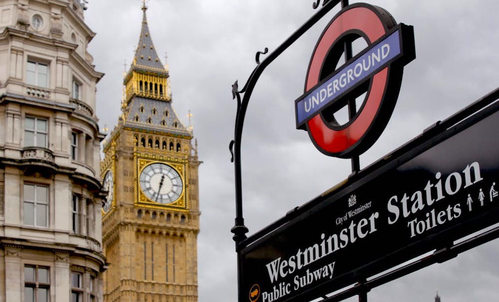
London Transport Logo
The distinctive London Transport roundel with its red circle and blue bar looks as fresh today as it did when it was first unleashed on the public way back in 1908.
It’s an abstract adaptation of a 1905 London General Omnibus Company winged wheel logo and used a red disc rather than a circle in its first form.
It’s changed little since the red circle was adopted in the 1920s and, like the stylised London Underground map it’s often matched with, has become an internationally recognised symbol of the city itself.
Pro tip: grab official merchandise at the London Transport Museum shop – gift heaven!
HP Sauce Logo
HP (Houses of Parliament) Sauce is Britain’s most popular brown sauce and the iconic Elizabeth Tower which houses the Big Ben bell has graced its bottles since it was launched in 1903.
According to the official website, 28 million bottles are sold each year, which would reach the same height as 6189 Houses of Parliament if stacked up.
The bottle currently sports a quirky (temporary) redesign to reflect the scaffolding that will surround the tower until 2021.
Pro tip: Eater’s London’s greatest bacon sarnies let you enjoy a match made in saucy heaven.
V&A Museum logo
The V&A Museum logo was created by Alan Fletcher in 1989 and it’s set in distinctive Bodoni font, with the three letters of the Victoria and Albert Museum’s nickname fused into a memorable symbol by removing half of the letter ‘A’ and using the ampersand to replace the crossbar.
While the museum’s eclectic collections are regularly refreshed, the logo has undergone no substantive alterations since its adoption, embodying a classy consistency that many a rival admires.
This London logo is an excellent example of subtle simplicity – definitely a modern classic.
Pro tip: specialist Kleen-Tex has logo mats for any type of enterprise.
These three famous logos perfectly exemplify many of the things that make this metropolis so special – from a sense of speed and flux to terrific taste and fine tradition. Look out for more legendary logos the next time you’re traversing London town.
The editorial unit


Facebook
Twitter
Instagram
YouTube
RSS