Five spring colours to use in imagery
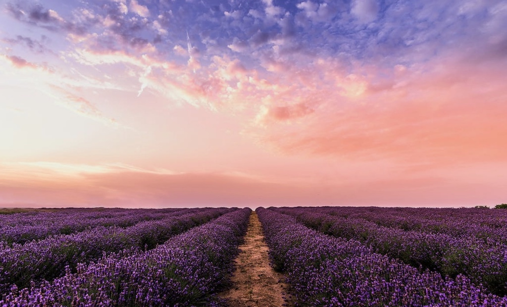
Spring, it is the blossoming of the year, a happy time and, for many, the beginning of warmer days. A great chance for online content to emulate this through imagery and colour. Matching the mood and energy of the season is a definitive way to keep content fresh and up to date. Audiences will want to be reading new content every month, so images should match this. As everyone moves into spring, it’s recommended injecting some spring colours into marketing palettes. Here they have helped identify five spring colours to begin using in imagery.
Pastels
The pastels are known for their links to springtime, every year pastel yellows and lilacs crop up in not only the natural world but the digital one too. Social media feeds, fashion articles and online blogs are full of these light and airy tones, as writers and content creators shift their content from dark and wintery to bright and fun for the new season. Keeping on trend with the popular shades of the season is a great way for content and imagery to stand out online.
2021 Spring pastels
Pastel Yellow: creamy, elegant, a symbol of warmer days. This colour will brighten imagery, beaming positivity across any content.
Pastel Lilac: A popular colour in fashion for spring 2021, but also a great colour to signify the beginning of spring and the widespread bloom of spring flowers.
Spring Green
Choosing a stunning light green to incorporate into imagery is the perfect way to enter spring. Green will help to freshen up marketing imagery, giving content that “spring clean” vibe. Pantone’s Green Ash is an excellent example of a go-to spring green for 2021. Choosing this subtle tone of green captures the fresh and youthful, but earthy tones that are popular this year.
Neutrals
For professionals, these bright, youthful colours may not match style or branding. Particularly if the content style is minimalistic. There is always the trusty neutral palette to fall back on, in this case. Neutrals do not have to be boring – and if Instagram is anything to go by – the browns and beige tones are certainly trending right now! With light tones of brown making a solid comeback, both across fashion and interiors, incorporating this colour palette into imagery is a great way to capture the attention of audiences and to keep content looking the part.
2021 Spring neutrals
Creamy beige: Beige does not have to be bland and dull; this colour has become a staple over the last few months and is certainly not going away anytime soon. A creamy beige is great for block colour which can then be layered with brighter, eye-catching colours and tones.
Cocoa brown: This shade of brown has grown in popularity since the beginning of 2021. Its complimentary tone creates the perfect base colour to keep imagery on trend. Using this colour in conjunction with other neutrals – or even metals – will work to make an attention-grabbing image for Spring.
The editorial unit


Facebook
Twitter
Instagram
YouTube
RSS